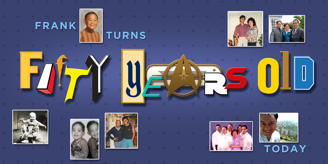
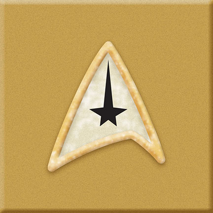
 I turned 50 today. And I decided to embrace it boldly and proudly. Taking the same route as my Christmas card art, I created this banner using selected moments, memories and achievements from my life to spell out my message graphically. This was a last minute project I thunk up for myself too. The notion to do this only hit me yesterday morning. I brainstormed words and letters for about fifteen minutes, then went about my day as thoughts and notions ruminated in my brain. I got to work with the actual graphic designing at 8:30p last night. As I'd hoped, I finished it just before midnight, as yesterday transitioned into my birthday. This morning, I spent a few hours to compose and write this blog. Figured you'd wanna know where each letter comes from. So here you go. Enjoy the read! 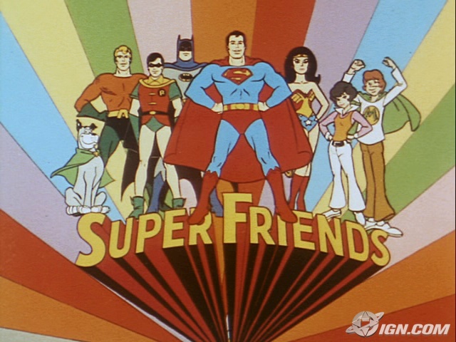 F is from Super Friends One of my favorite Saturday morning cartoons growing up. 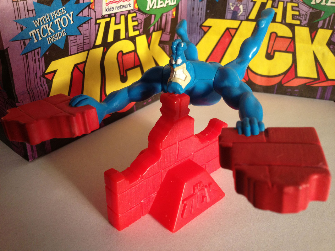 I is from The Tick The first kid's meal toy program I worked on from start to finish was for a comic book super hero that I'd never even heard of before. The Balancing Tick (at left) and Charles the Brainchild toy (concept sketch below and photo of the produced piece here) were the first toys I ever designed. Check out my portfolio page to find my original concept sketches of The Tick toy. 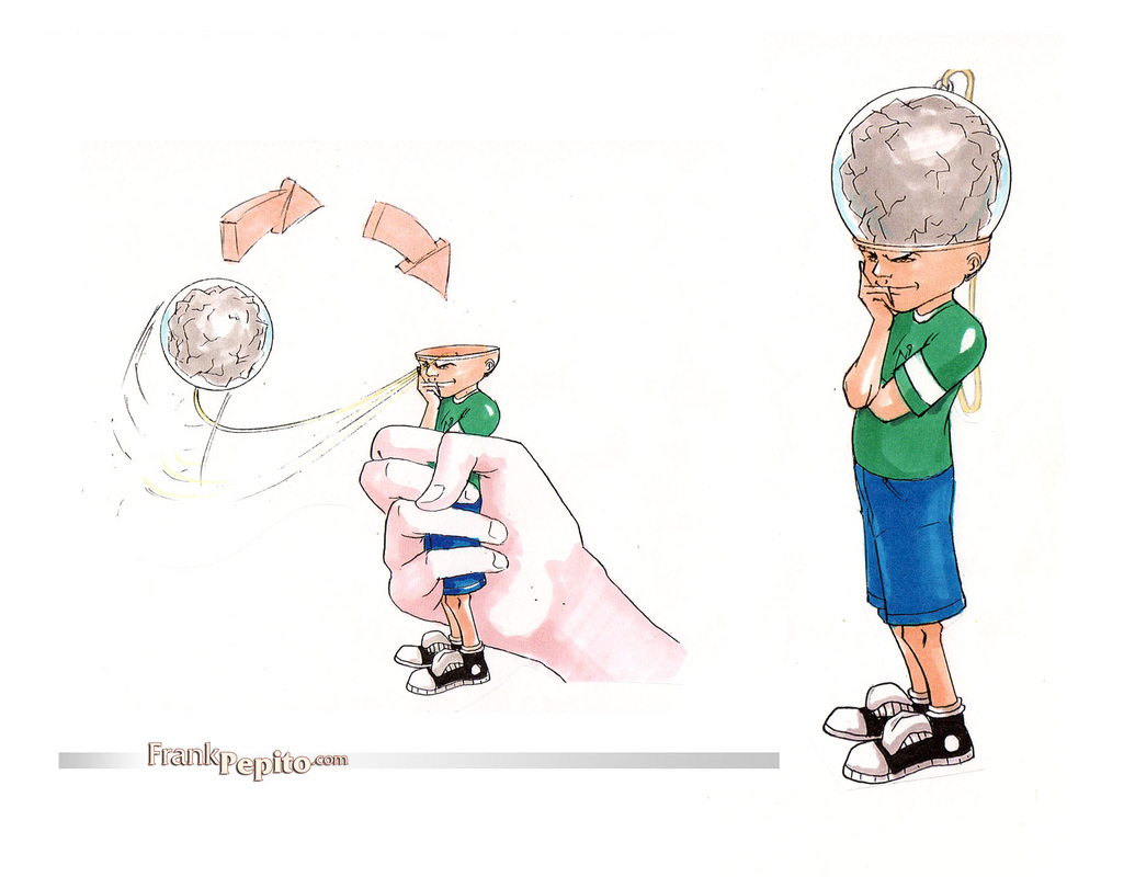  F is from Buffy the Vampire Slayer This is but one of many geek shows I loved watching. Others were The X-Files, Xena: Warrior Princess, Firefly & Serenity and most anything with "Star Trek" in the title. 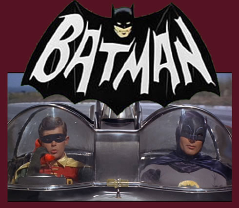 T is from Batman I loved this show as a kid! Batman is my favorite comic book hero to this day. 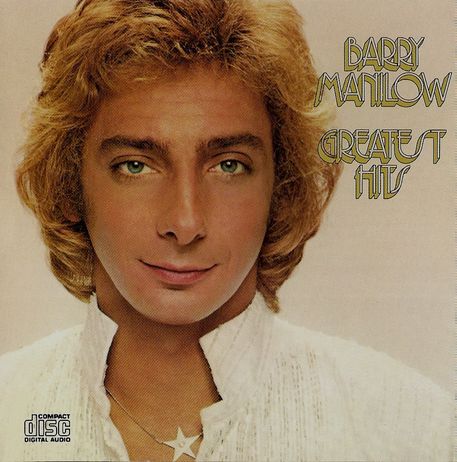 Y is from Barry Manilow Yes, I am a Fanilow. And darn proud of it. Back in the day, there was this thing called the Columbia Record Club where you could get like 6 records for a penny. This two-LP set was one of the ones I ordered. 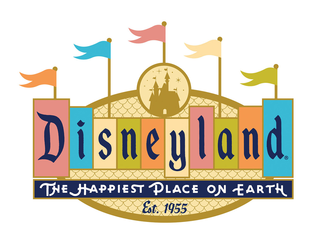 Y is from Disneyland That's no surprise, right? I have hundreds of photos I've taken at various Disney events and parks posted on Flickr, including the one below from my experience joining hundreds of thousands of Disney fans at three in the morning to celebrate Disneyland 50th birthday. Click it to check out the entire gallery. 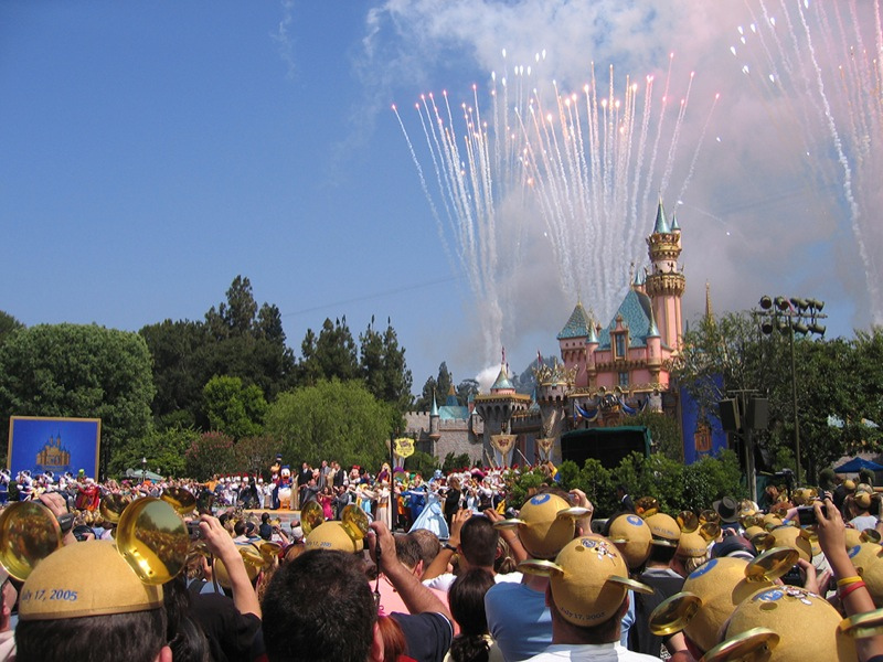 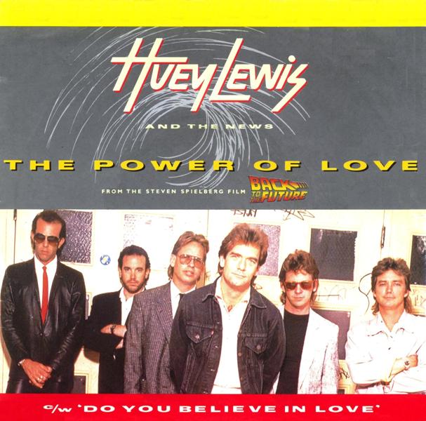 E is from Huey Lewis and The News My favorite rock band, the voice of my college-age self. 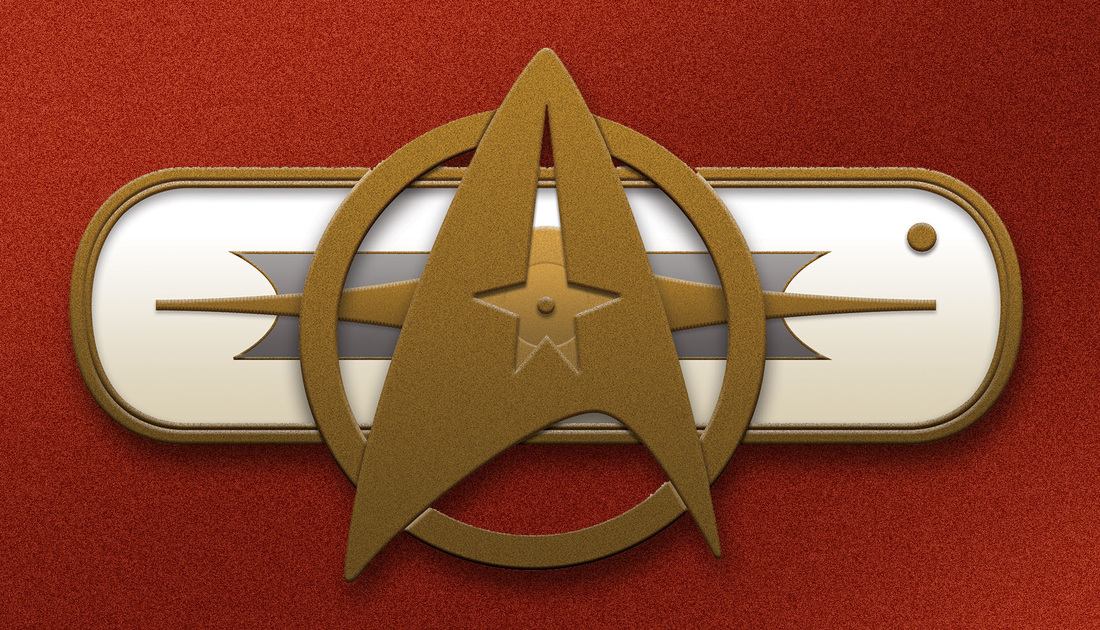 A is formed by the Starfleet Uniform pin from Star Trek II: The Wrath of Khan Like I mentioned before, I've been a Star Trek fan since the original series. The art I used for the "a" is a graphic I rendered myself, first for a tee-shirt design and then an infographic I created this past year that's posted over at this site. 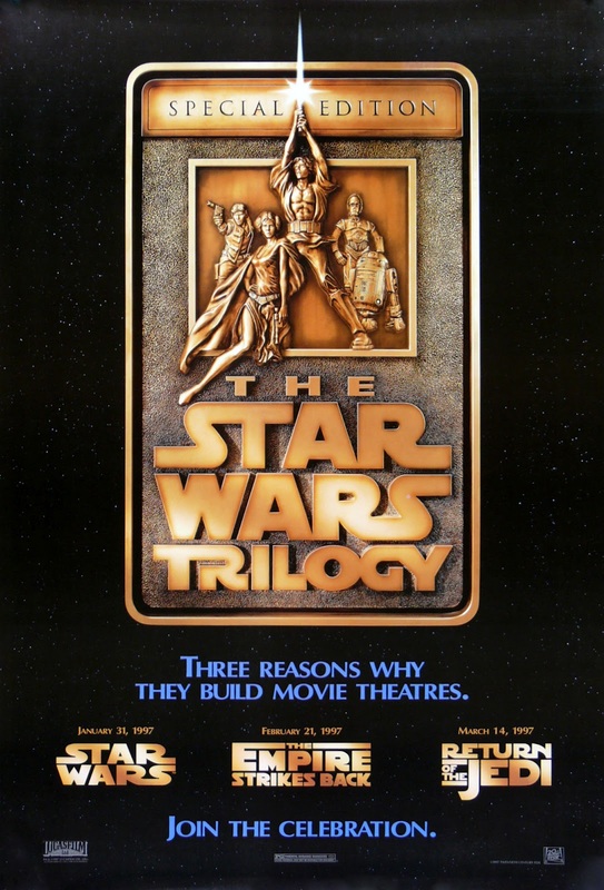 R is from Star Wars Trilogy Special Edition I designed Star Wars kid's meal toys. And for that, I was forced to take many business trips to a place called Skywalker Ranch. Ho hum.. Below is a Taco Bell promotional header card showing the toys in the promotion, shamelessly pointing out the ones I concepted in the series. You can see some of my concept art on my portfolio page. 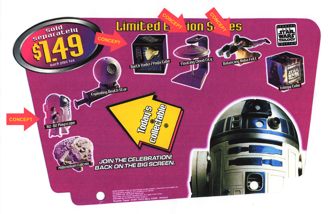  S is from San Diego State University That's where I went took the five-year plan to earn my degree. This was the logo they were using oh those many moons ago. 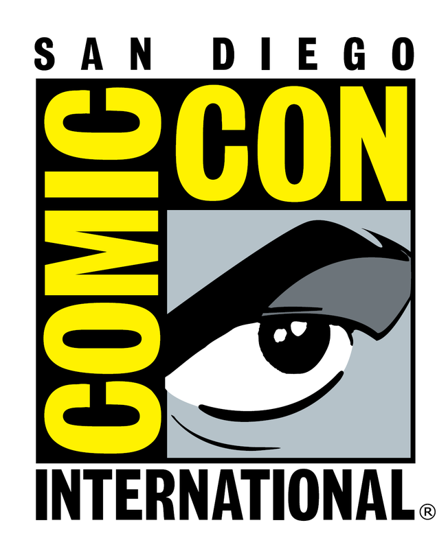 O is from San Diego Comic-Con International The first time I went to Comic-Con, Bob Kane, the co-creator of Batman, was there to help ease fans' fears about Michael Keaton being cast as Batman. Comic-Con then was nothing like the monster it is now. Visit Flickr to see my pix from my visits to Comic-Con and WonderCon over the past few years. 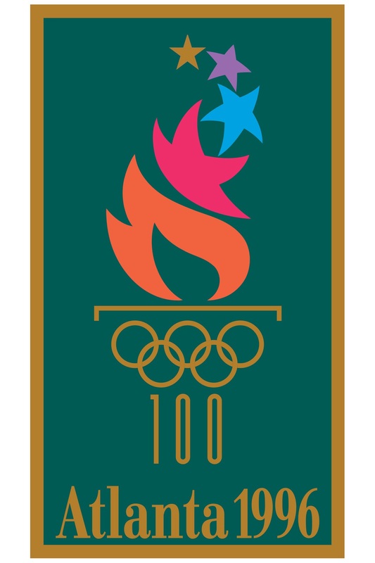 L is from the Atlanta 1996 Olympic Games At the first company that hired me after graduating college, I got to build and manage a staff to design and develop lapel pins and collector's pin sets for the Olympic Games sponsors and retailers when Atlanta hosted the games. All that experience working personally with the licensing office in Atlanta, as well as with licensing offices on other sports licenses, groomed me well for my eventual work designing products for licensed entertainment properties like The Tick and Star Wars.  D is from DC Comics This is the 1970's version of the logo that I saw on the covers of the comic books I read and collected back in the day. I still read comic books today which, since I have freelance work for clients including Sideshow Collectibles, doubles professionally as "research"! Below is the first of many other projects I've worked on at Sideshow this past year, including some DC Comics characters, that should all finally see the light of day beginning in 2014. 
5 Comments
 A little movie came out on Blu-ray last week. You may have heard of it: Star Trek Into Darkness. It became the latest addition to my home video library and Star Trek collection, both of which are fairly extensive. I have been a Star Trek fan for many years. I grew up on The Original Series cast and later became a fan of The Next Generation. That's when I finally started going to Star Trek conventions and continued to enjoy the other spinoff series. And if you go check out my pictures on Flickr, you'll see me use my Star Trek collection to get creative.  A few weeks ago, I got the idea to design and illustrate a Star Trek infographic. It would show all the ways the arrowhead insignia originally worn by the crew of the U.S.S. Enterprise has appeared and been adapted on each of the different versions of Star Trek, from the movies, the TV shows, the spinoffs, even the original pilots and animated series. The idea appealed to me as a Star Trek geek and also as a designer interested in seeing all of these creative incarnations assembled together into one place. Plus, I'd have the fun of rendering them as accurately as possible based on finding the best photo reference for each one. I spent many hours going through my Star Trek DVDs, Blu-rays and books. It really became an obsession. I scoured the Internet for stills to also use as reference and visited websites like Memory Alpha to see what they identified as Starfleet insignia to make sure I considered everything. My only criteria was that I'd just include variations of the original 1960's arrowhead patch, or delta shield as fans have also called it. And as the logo started appearing on hats and belt buckles in the movies, I limited it to just when it was worn over the left breast on uniforms, to keep this infographic focused and consistent. The only indulgence you'll find on it is when I included images of the various designs of the starship Enterprise associated with each insignia. The evolution of the design of each starship named Enterprise is pretty fascinating as well, especially regarding the little aesthetic details found on the original 1960's television model. 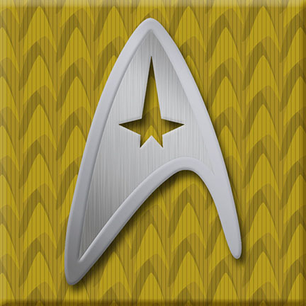 For logos like the dagger-based Mirror universe one or the starship-based patches worn on Scott Bakula's Enterprise series, they're not here because they didn't include the arrowhead motif. Maybe they'll turn up in a future infographic if I decide to do another one. Originally I planned to get this done by last Tuesday to post on the day Star Trek Into Darkness came out on Blu. But I didn't get it finished, and I'm glad I didn't. Watching the new film I found a lot more and clearer reference that I didn't have before. So this infographic ended up becoming as comprehensive a collection of that insignia as possible, right down to this last movie. So, I'll stop talking now and just share it already! It's posted below. Click on it to go to my deviantART page. On that page, click the art there to blow it up and see it larger. As I pat myself on the back for this, let the nitpicking - and God forbid, citing mistakes - begin!  |
All About Me
A fan of Star Trek, Star Wars, Harry Potter, Batman, comic books, Blu-rays, Disney, soundtracks, taking pictures, theatre and...Barry Manilow! Archives
March 2019
Categories
All
|
 RSS Feed