 A little movie came out on Blu-ray last week. You may have heard of it: Star Trek Into Darkness. It became the latest addition to my home video library and Star Trek collection, both of which are fairly extensive. I have been a Star Trek fan for many years. I grew up on The Original Series cast and later became a fan of The Next Generation. That's when I finally started going to Star Trek conventions and continued to enjoy the other spinoff series. And if you go check out my pictures on Flickr, you'll see me use my Star Trek collection to get creative.  A few weeks ago, I got the idea to design and illustrate a Star Trek infographic. It would show all the ways the arrowhead insignia originally worn by the crew of the U.S.S. Enterprise has appeared and been adapted on each of the different versions of Star Trek, from the movies, the TV shows, the spinoffs, even the original pilots and animated series. The idea appealed to me as a Star Trek geek and also as a designer interested in seeing all of these creative incarnations assembled together into one place. Plus, I'd have the fun of rendering them as accurately as possible based on finding the best photo reference for each one. I spent many hours going through my Star Trek DVDs, Blu-rays and books. It really became an obsession. I scoured the Internet for stills to also use as reference and visited websites like Memory Alpha to see what they identified as Starfleet insignia to make sure I considered everything. My only criteria was that I'd just include variations of the original 1960's arrowhead patch, or delta shield as fans have also called it. And as the logo started appearing on hats and belt buckles in the movies, I limited it to just when it was worn over the left breast on uniforms, to keep this infographic focused and consistent. The only indulgence you'll find on it is when I included images of the various designs of the starship Enterprise associated with each insignia. The evolution of the design of each starship named Enterprise is pretty fascinating as well, especially regarding the little aesthetic details found on the original 1960's television model.  For logos like the dagger-based Mirror universe one or the starship-based patches worn on Scott Bakula's Enterprise series, they're not here because they didn't include the arrowhead motif. Maybe they'll turn up in a future infographic if I decide to do another one. Originally I planned to get this done by last Tuesday to post on the day Star Trek Into Darkness came out on Blu. But I didn't get it finished, and I'm glad I didn't. Watching the new film I found a lot more and clearer reference that I didn't have before. So this infographic ended up becoming as comprehensive a collection of that insignia as possible, right down to this last movie. So, I'll stop talking now and just share it already! It's posted below. Click on it to go to my deviantART page. On that page, click the art there to blow it up and see it larger. As I pat myself on the back for this, let the nitpicking - and God forbid, citing mistakes - begin!
0 Comments
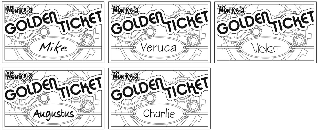
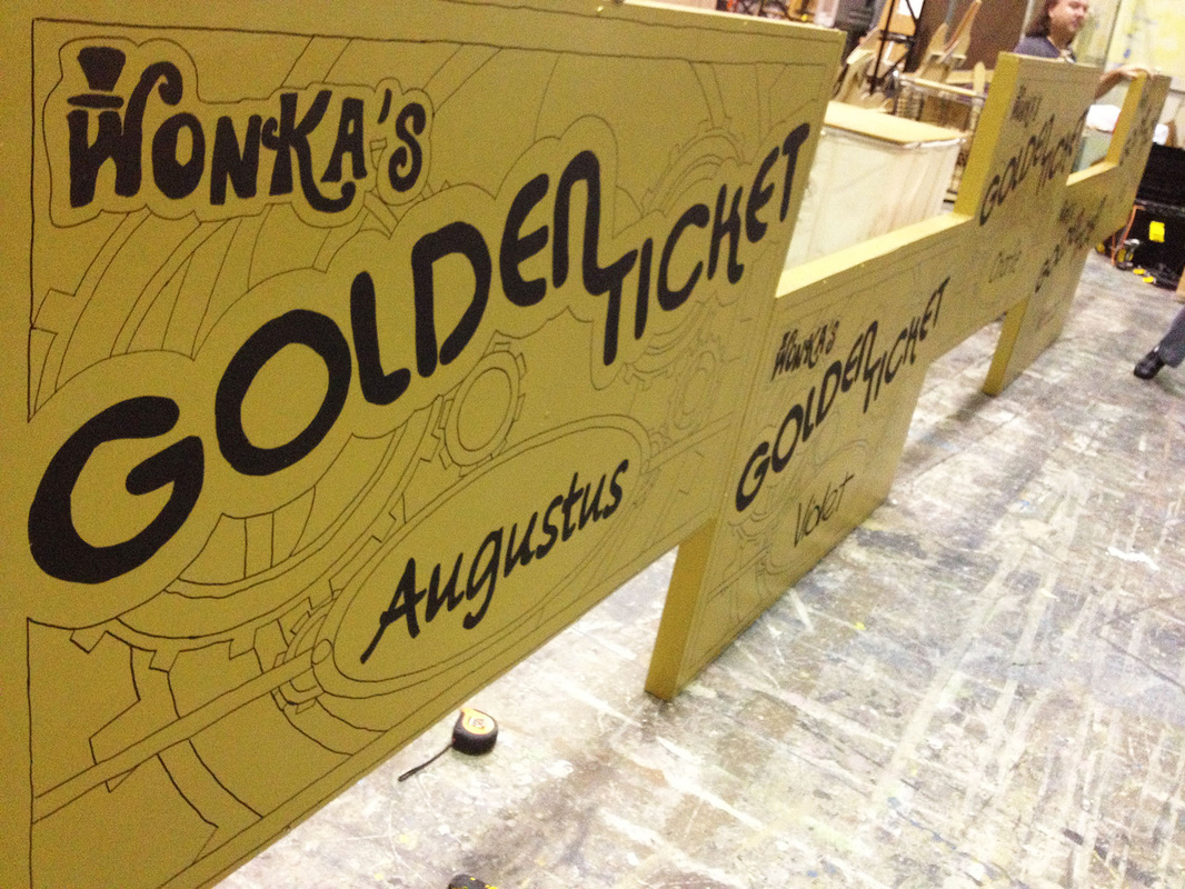
They started with this. I whipped up the above artwork for my friends building the set of Roald Dahl's Willy Wonka, last month's musical staged by the Torrance Theatre Company and one I was also cast in, playing the part of reporter-to-the-Golden-Ticket-winners Phineous Trout. The artwork would be applied to large 5' x 3' boards installed at the top of the proscenium of the Armstrong Theatre and illuminated with animated magical effects during every show. Now whenever I'm in a show, I like to try to do something creative and special for the cast, to hand out on opening night or closing night. For this show, I had to consider something I could produce for about forty cast members and about half as many more crew members, something that wouldn't get in the way of me missing (too much) sleep to get them sixty-odd pieces done and looking pretty. In my last show, 12 Angry Men, I made a card with a wheel that can be turned to reveal jokey verdicts through a cut-out window and a simple pop-up card that I handed out to the cast and crew on opening and closing nights. They turned out well enough and everyone got a kick out of them. I also had fun making them, and they turned out to be fairly simple to do yet were impressive to receive. (Pats myself on the back.) So immediately the idea of again doing something involving paper engineering came to mind. I browsed through some books on paper engineering I own for inspiration and also to see what would be simplest to produce for a cast of thousands! Ok, sixty people. But I didn't want this to feel like I was making enough for thousands.
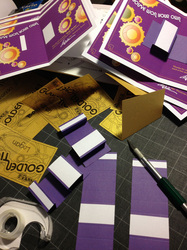
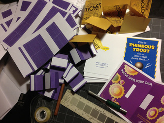
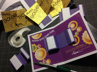
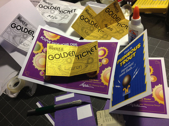
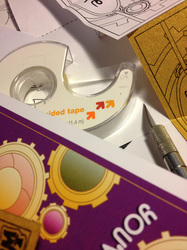
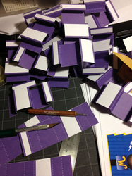
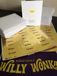
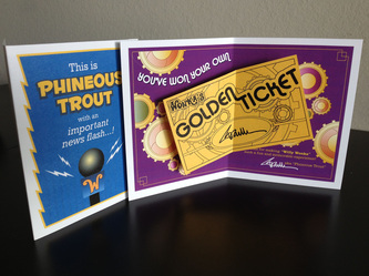
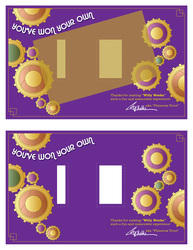
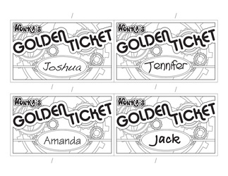
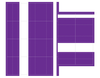
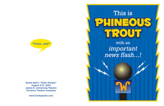
After I finished the Golden Ticket art, I occurred to me that not only was that the perfect graphic element to share with everyone, but also that half my graphic design time was theoretically done if I was able to use it in whatever I came up with! (On top of taking the time to brainstorm, design and make these whatevers, I still had rehearsals to go to too! So time management was a bit important to me.) I decided I wanted to do something a little more exciting than the simple pop-up I did for 12 Angry Men. And quickly the idea of opening a card to reveal a real Golden Ticket popping up at them became my focus and my goal. My biggest challenge being a novice paper engineer was how to make it pop up! But a little trial and error building white model mockups aided me in figuring that out fairly quickly. Next up was designing the graphics for what would appear on the rest of the card, what would appear behind the Golden Ticket that popped up and what would the cover say to set up what they'd find inside. I was again able to save some time by re-using the gears from my Golden Ticket art to use in the background spread of the inside. And since this was coming from the reporter in the show who introduces himself to the audience by saying "This is Phineous Trout!", the concept for the cover arrived quickly too. As the art was getting done, I printed them out to mockup some more white models to see how it was looking and also to make sure the placement of the Golden Ticket didn't block my text and message in the card. Once I signed off on my own graphic design, it was off to the local craft stores to find just the right kind of gold paper to print the Golden Tickets on, because Golden Tickets need to be gold (duh) and sparkly! (And because I could then print them as black and white art, it would save me a hell of a lot of money on toner too!) Thank God for Scrampers, a scrapbooking supply store that was the only place I found with just the right paper I was hoping to find! I also bought a box of Avery 5 1/2" x 4 1/4" Note Cards for the base cards; pre-scored and perforated-to-size was another time-saver I banked on. And since I already had white card stock at home for the pieces going under the tickets to lift them up - card stock being sturdier than thin copy paper - I just needed toner - lots of toner - and I was ready to print, cut and score. Below are images of my final artwork and shots I took during construction. I didn't have time to produce anything for opening night, so I was glad I got these done to hand out on before the show on closing night. I was very happy with the way they turned out. Thankfully, so were my very talented castmates and the backstage crew who worked hard throughout the production. Check out my portfolio to see other paper engineering projects I've done for fun! |
All About Me
A fan of Star Trek, Star Wars, Harry Potter, Batman, comic books, Blu-rays, Disney, soundtracks, taking pictures, theatre and...Barry Manilow! Archives
March 2019
Categories
All
|


 RSS Feed